Make returning easier than restarting.
I followed one task through an interruption. The proposal preserves the accepted plan and selected step, then lets the person return in focus or checklist mode.
Independent design study. Not commissioned by Numo. Proposed work, revised October 2026.
The useful moment may be the return.
A person starts a task, pauses, and opens the app later. The app can remember a checked box while still leaving the person to reconstruct what they were doing. I chose that return moment as the subject of this study. The breakfast sequence below is an authored scenario, not a diary-study participant’s account.
The task-creation flow reviewed in Mobbin shows a Today surface, task breakdown, adding tasks and voice input. It establishes available interface routes. It does not establish how often people abandon tasks or which breakdown they find useful.
My working hypothesis is narrow: preserving the accepted plan and an obvious next action may reduce the work of returning. The competing explanation is that the step itself is unclear or no longer relevant. A focus screen cannot repair that by making the text larger.
“Make breakfast” is a goal. “Put a bowl on the counter” is an action.
I changed the example because the earlier breakdown mixed broad instructions with concrete actions. I now use a five-step, explicitly authored plan: get the cereal, get the milk, put a bowl on the counter, fill the bowl and put the ingredients away. It is a fixture for explaining interaction, not dietary advice or a recommended routine.
The person must be able to edit or replace an unhelpful step before accepting the plan. I would preserve their accepted wording on return. Regenerating a different plan each time might look intelligent while destroying continuity.
This means the proposal has two dependencies: understandable step wording and reliable state. If either is missing, adding a new presentation mode is premature. I would test those dependencies before attributing any benefit to focus mode.
Focus is an option, not a prescription.
A checklist gives an overview and allows someone to choose a different next action. A single-step view reduces the amount visible at once. Neither is universally preferable, including for people with ADHD. I chose to let the person move between them while keeping one shared plan and completion state.
The revised Today screen preserves the task-add and microphone routes. My earlier proposal removed them while describing the change as a small addition; I corrected that scope mismatch. The new return card shows the parent task, progress and a next action, with “See all 5 steps” beside the continuation path.
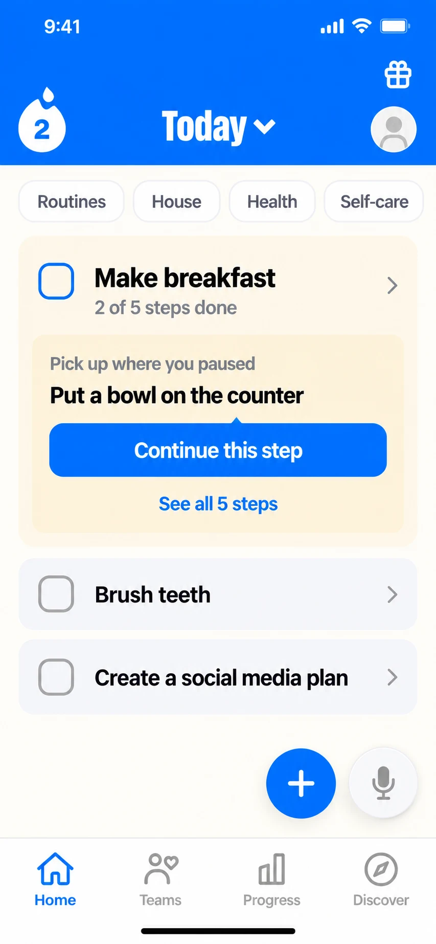
I put the task, completed steps and chosen next action together so a return does not begin with reconstructing context. Add task and voice input stay visible because this card must not take over Today.
Authored proposal · A return card supplements Today. Add task and voice input stay available. The five-step breakfast plan and other tasks are illustrative.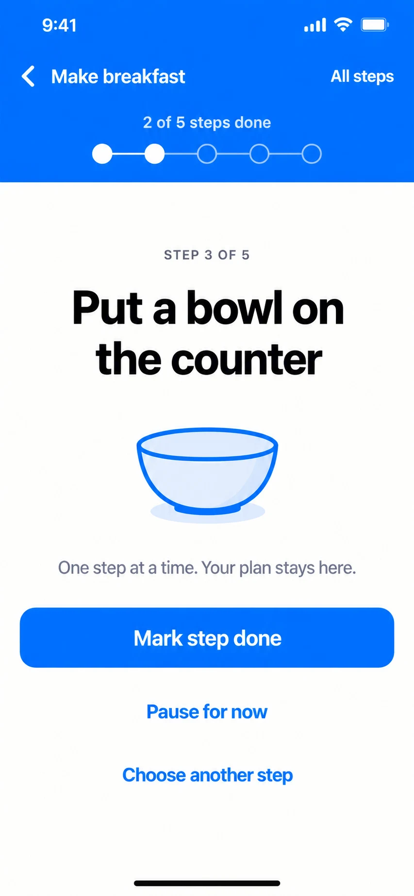
I carry the same selected step into a focused view and keep Pause and Choose another step available. Progress changes only through Mark step done; opening or leaving the screen is not completion.
Authored proposal · The same five-step breakfast fixture as Today; no clinical benefit is claimed.Both screens show the same paused example: two of five steps are done, and putting a bowl on the counter is selected next. Continuing changes the view, not the completion count. I keep the parent task and step position visible so focus does not strip the action of its context.
Completion is not the only legitimate exit.
After the person marks the bowl step done, the checklist shows three of five completed and two remaining. The final screen is a later state, after those two remaining actions are also explicitly completed. I show both states because a single success screen would hide what counts as progress.
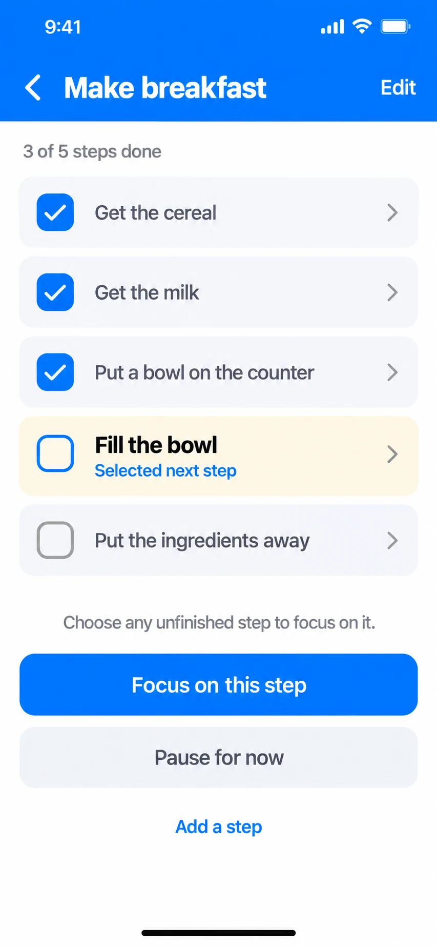
After the bowl step is marked done, the checklist shows three checked steps and two remaining. I keep Focus on this step separate from the checks so choosing a different next action cannot falsify progress.
Authored continuation · Follows explicit completion of the bowl step. Switching view does not complete a task.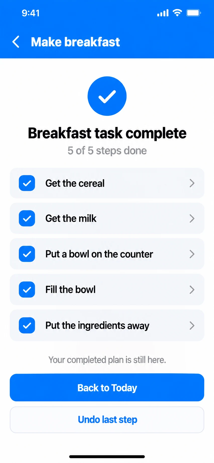
Only after both remaining steps are done does the task show 5 of 5. I chose Back to Today and Undo last step over a streak prompt: completion should close this task and remain correctable.
Authored outcome · Later in the same example, after the remaining two actions; not an automatic jump from three to five.A pause retains the selected step and checked items. Returning should show that context. Choosing another step changes focus without marking the skipped step complete. Only finishing the last outstanding step completes the parent task in this proposal.
I rejected a forced “finish this step before continuing” rule. It would make the progress model simpler but turn the app into an obstacle when the person’s situation changes. I also rejected resetting the focus to the first unchecked step on every return: a manually chosen next action deserves to survive an interruption.
The images specify the intended continuity, not its technical reliability. A production version would need to preserve accepted wording, selection and completion across restarts, distinguish a local update from a synchronized one, and resolve concurrent changes. Those requirements belong to the same design decision: remembering the wrong place is not a useful return.
A tidy session cannot stand in for a real day.
I would ask participants to use their own tasks and capture a small number of actual interruptions over several days. The question is whether they can return without reconstructing the plan, and whether the chosen mode helps them. A moderator-led breakfast task alone would be weak evidence for that claim.
For each return, I would record what had changed, whether the person continued, edited, switched, rescheduled or abandoned the task, and why. A short follow-up would check whether the app’s remembered state matched their intention. Abandoning an obsolete task should not automatically count as failure.
Accessibility checks would include text scaling, screen-reader task context, large touch targets, reduced motion and whether color is the only progress cue. The proposal avoids countdown pressure and preserves the full plan one action away.
Test continuity before expanding the feature.
The reachable group is people who already accept a breakdown and later return to it. A top-line audience estimate would overstate the opportunity. I would first compare a lightweight “Continue where you paused” entry with the existing checklist, then test the additional focus surface only if return difficulty remains.
The product value is conditional: less reconstruction may make an existing task more useful and support voluntary return. That is not a retention result, and it is not a clinical claim. The cost includes plan editing, state restoration, accessibility and maintenance of two views.
I would simplify or remove focus mode if people prefer the checklist, if the next step is routinely unsuitable, or if the extra surface hides task creation. The stronger outcome could be better task wording and a reliable return link, with no new mode at all.